Work

Carmine

Cocktail bar2026

Carmine

Marketing site

Explore Carmine

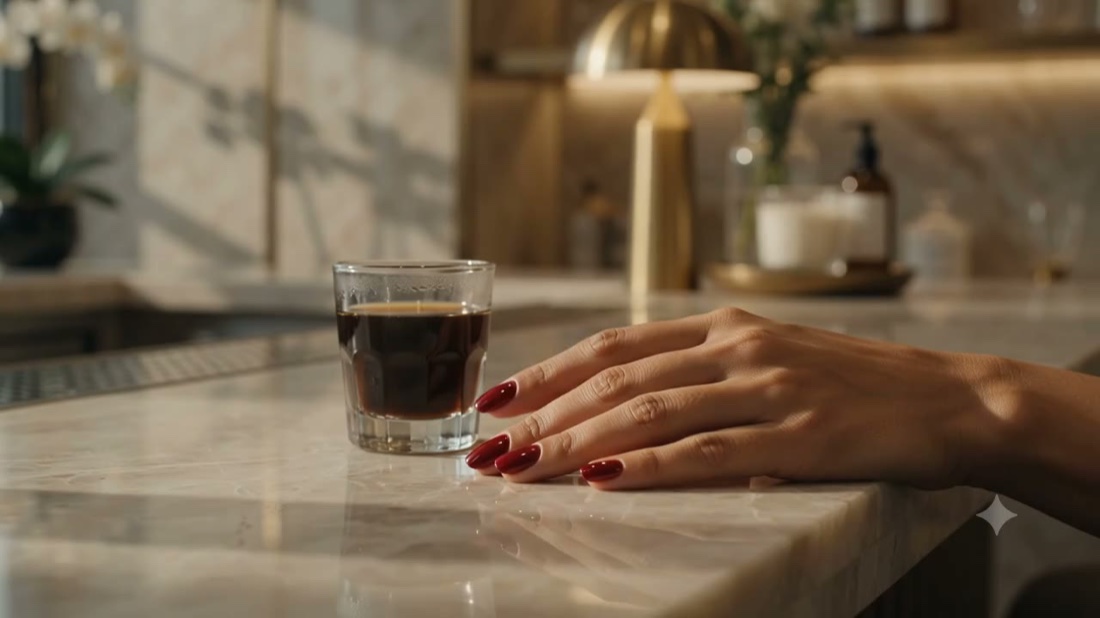
Carmine is a small late-night cocktail bar built around the second glass. The site is moody and image-led, with a short seasonal list, the room and a quick route to holding a seat, all kept dark, calm and unhurried.

Studio role
Design, Build, Art direction

The brief

A late-night bar lives on atmosphere, but a website usually flattens it. Carmine needed to feel like the room itself and still get someone to the list and a booking in a few taps.

Our approach

We led with candlelit photography and serif headlines that fade and lift over it, kept the list short and legible, and held booking a scroll away throughout. A single crimson carries the brand against near-black oxblood, and slow reveals keep the whole thing composed rather than busy.
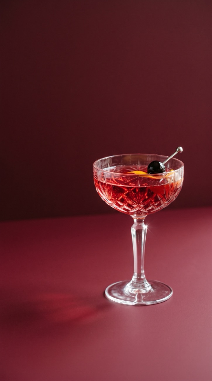
Moody and image-led, near-black oxblood and deep wine under soft porcelain type with a single crimson accent. Serif headlines fade and lift over candlelit photography as the room drifts with the scroll.
Auré

Aesthetics clinic2026

Auré

Marketing site

Explore Auré

Auré is an aesthetics clinic that wanted to feel considered rather than clinical. The site is built around its treatment menu, with each service given room to breathe and a clear route to booking a consultation.

Studio role
Design, Build, Copy

The brief

Aesthetics clinics tend to look either coldly medical or oversold. Auré needed to read as expert and reassuring at once, and turn quiet browsing into booked consultations.

Our approach

We led with an editorial treatment menu, gave each service room to breathe, and used calm typography and slow reveals so the clinical detail reads as reassurance. Booking is never more than a tap away, and the whole thing is hand-built to load fast on a phone in a waiting room.

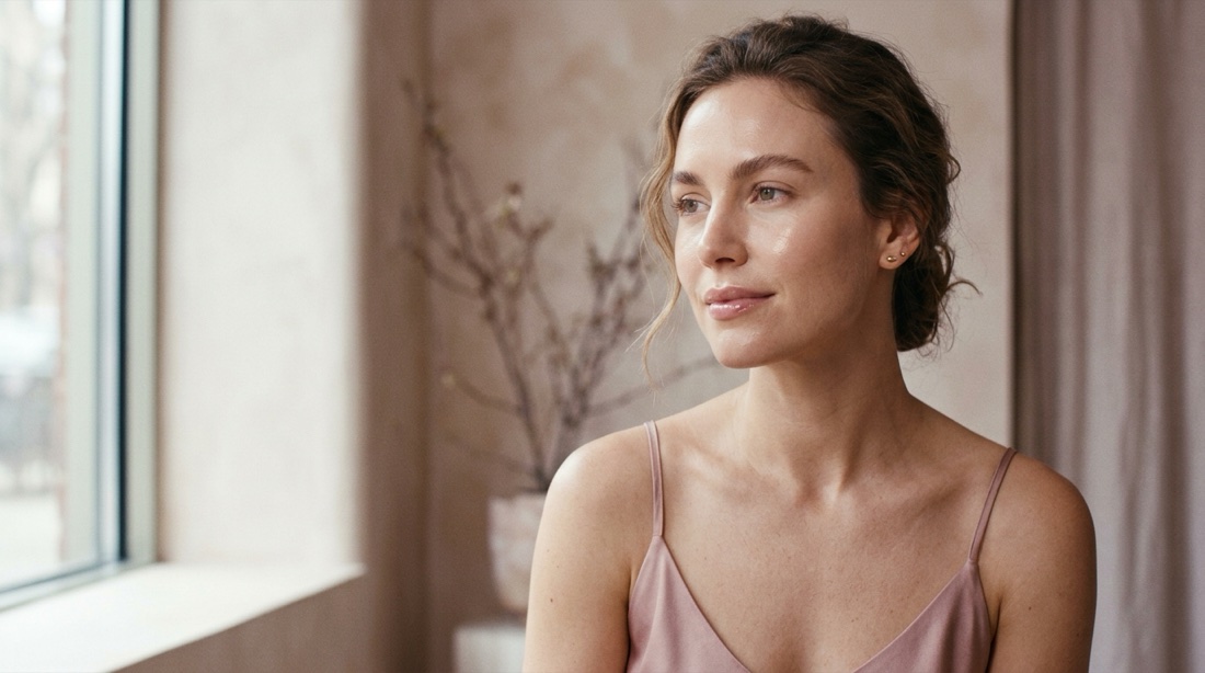
Editorial layout with calm serif headings and generous white space, set in soft blush, warm stone and deep cocoa. Slow reveals keep it composed rather than clinical.
Botanique

Flower studio2026

Botanique

Marketing site

Explore Botanique

Botanique is a small flower studio, so the site is warm and led by the flowers. Seasonal bouquets and a small shop come first, the studio and its people get room to breathe, and a same-day request is always a tap away.

Studio role
Design, Build, Art direction

The brief

A flower studio sells on feeling and freshness, but most florist sites look like a generic shop. Botanique needed to feel hand-made and local, and still get someone to a bouquet and a request quickly.

Our approach

We led with photography and a high-contrast serif paired with a flowing script, scattered the studio's strengths across soft cards, and built a small shop behind a big seasonal word. Sage and blush sit on warm cream, the hero flowers drift against the type, and generous spacing lets every section breathe.

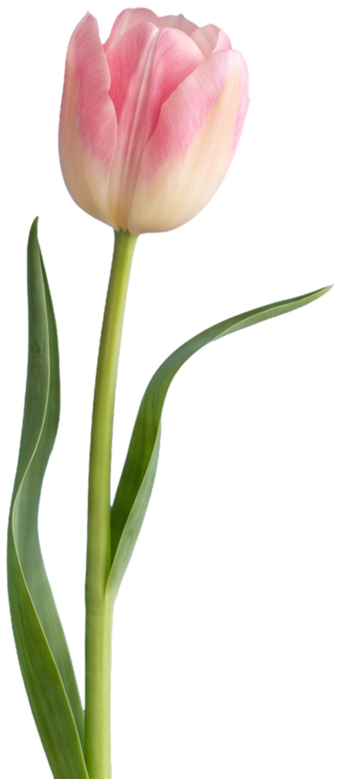
Warm and light, sage green and dusty blush on cream with coffee-brown type. A serif and script pairing carries the headlines while photography leads, and the hero flowers drift against the words on a gentle parallax.
Rivea

Nail spa2026

Rivea

Booking site

Explore Rivea

Rivea is a nail spa where most visits start on a phone, so the whole site is built around getting to a booking in a few taps. Services and pricing are laid out plainly, and the imagery carries the calm, tactile feel of the salon.

Studio role
Design, Build, Booking flow

The brief

Most of the spa's visits begin on a phone, but its old flow buried availability behind too many taps. It needed to feel calm and tactile while making a booking almost frictionless.

Our approach

We designed a booking-first layout with plain services and pricing, a short and forgiving reservation flow, and soft parallax that gives the pages depth without slowing anything down. The result feels closer to the salon than to a generic booking form.

Tactile and unhurried, warm gold over cream with soft brown type. Gentle parallax adds depth while the imagery carries the calm of the salon.
Alba

Restaurant2026

Alba

Marketing site

Explore Alba

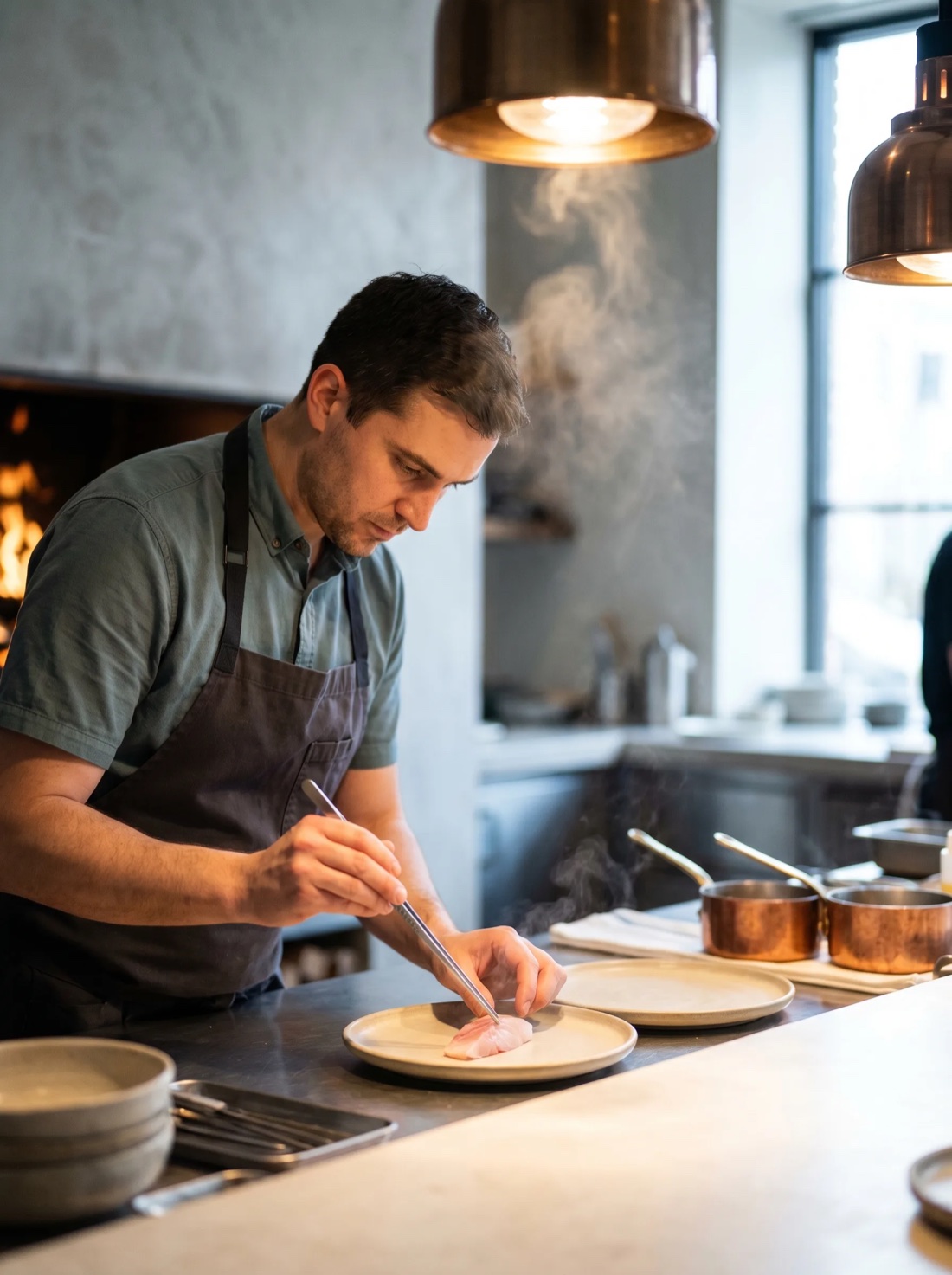
Alba is a restaurant that lets the food do the talking, so the site is image-led from the first frame. Dishes are framed full-bleed, the menu and story unfold as you scroll, and reservations are always one tap away.

Studio role
Design, Build, Art direction

The brief

The restaurant's food was its strongest asset, but the old site hid it behind text. It needed to make someone hungry within seconds and then make booking a table effortless.

Our approach

We made it image-led from the first frame, framing dishes full-bleed and letting the menu and story unfold as you scroll. Text fades and lifts into place over the photography, and gentle parallax keeps the scenes alive rather than static.

Image-led and full-bleed, a dark warm room lit by firelight. Large type fades and lifts over the photography as the scenes drift with the scroll.
Quince

Private chef & catering2026

Quince

Marketing site

Explore Quince

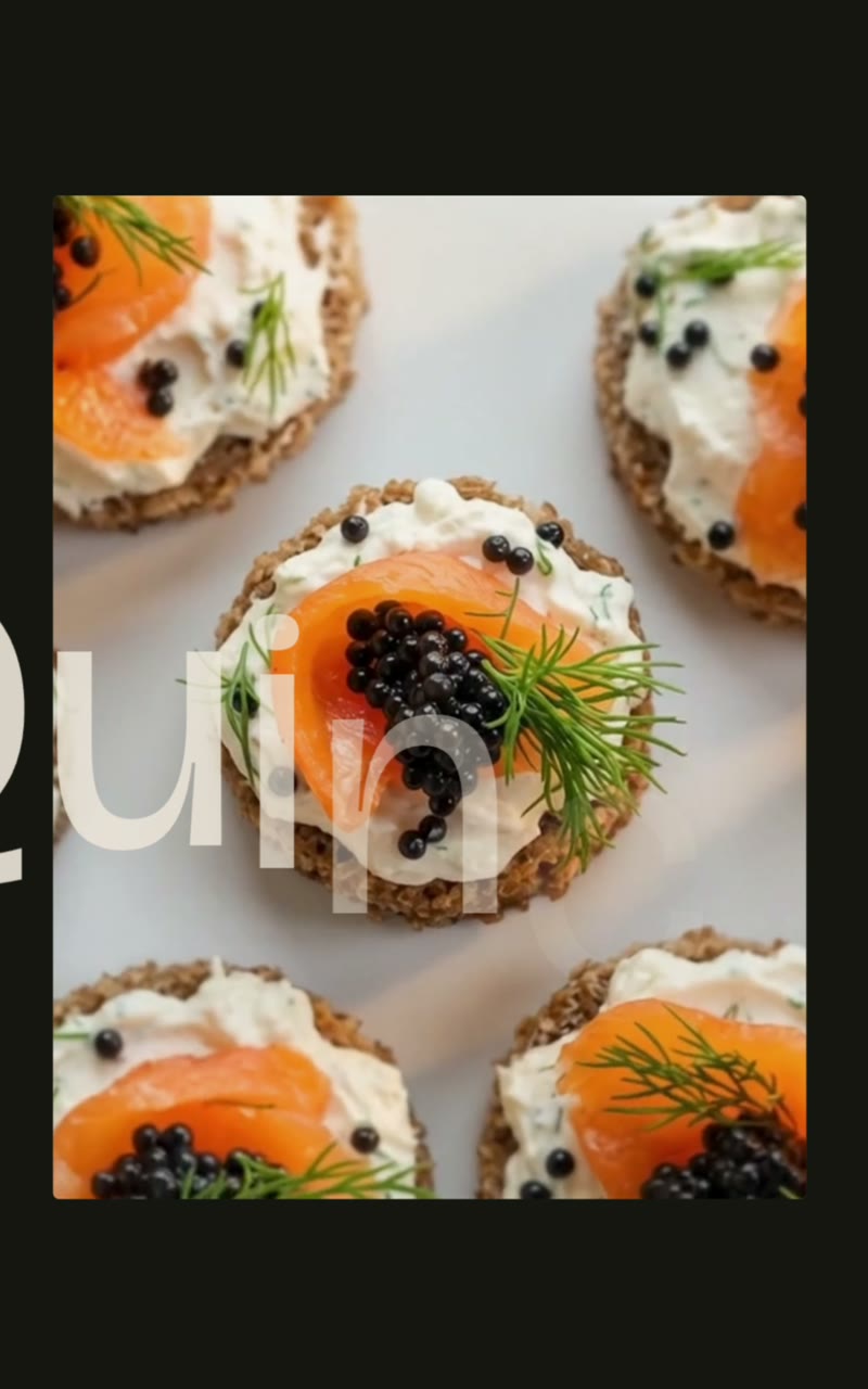
Quince is a private chef and catering studio cooking close to the season. The site leads with warm, generous tables, sets out how a booking works, and keeps enquiry within reach, so a browse turns into a conversation.

Studio role
Design, Build, Content

The brief

Private catering sells on trust and taste before a first call. Quince needed to convey warmth and craft quickly, and make enquiry effortless.

Our approach

We led with seasonal menus and the feeling of a generous table, spelled out how a booking works, and kept enquiry a scroll away. Soft reveals and steady type carry the studio's warmth without slowing the read.

Warm and seasonal, soft sage over pale green with a warm ochre accent. Generous imagery and steady type give the table its warmth.
Curaa

AI procurement2026

Curaa

Product site

Explore Curaa

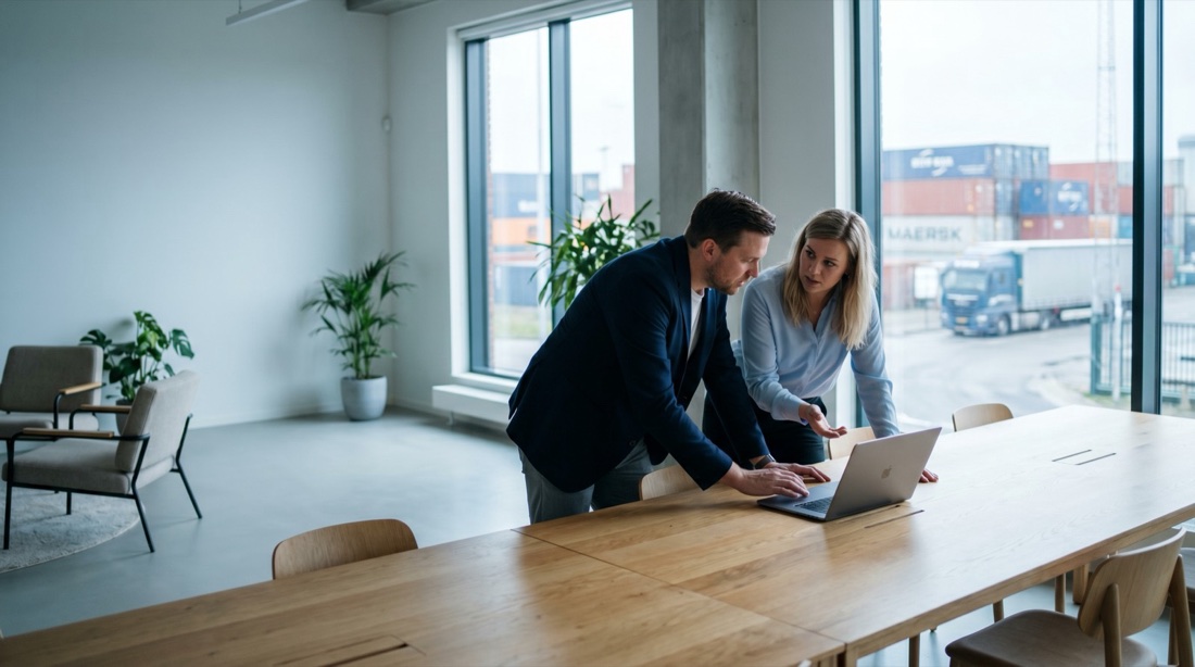
Curaa is an AI procurement tool aimed at busy buyers, so the product site has to make its value obvious in seconds. The proposition leads, product detail is laid out cleanly for people who want to dig in, and there is always a clear path to a demo. Type-led sections transition in as you scroll and the interface mockups carry the story, keeping the page focused and credible rather than overloaded. Built to convert a skim into a booked call.

Studio role
Design, Build, Content

The brief

Busy procurement buyers skim. Curaa had to make its value obvious in seconds, give detail to those who dig in, and keep a clear path to a demo throughout.

Our approach

We led with the proposition, laid product detail out cleanly for people who want to dig in, and kept a clear path to a demo on every screen. Type-led sections transition in as you scroll and interface mockups carry the story, keeping the page focused rather than overloaded.

Product-led and type-driven, deep blue and soft white with clean interface mockups. Sections transition in as you scroll to keep the page focused, not overloaded.
Privé Pilates

Pilates studio2026

Privé

Booking site

Explore Privé

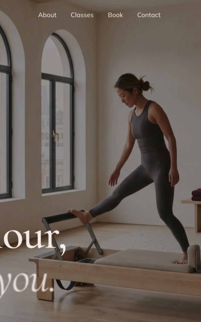
Privé is an appointment-only pilates studio offering private and small-group reformer, mat and tower sessions. The site leads with the sessions, keeps times and booking within reach, and carries the calm, one-to-one feel of the room.

Studio role
Design, Build

The brief

An appointment-only studio needs newcomers to understand the sessions and book without friction, while keeping the calm, private feel of the room.

Our approach

We led with the session types, kept class times and booking a scroll away, and used soft reveals and warm type to hold the studio's private, one-to-one feel throughout.

Calm and warm, bordeaux over warm off-white with a wine accent. Soft reveals and steady type keep the private, one-to-one feel of the room.

Tell us what you have in mind.